In our fast-paced world, managing money wisely is crucial. Many people experience financial stress because they struggle to understand their investment data.
Imagine trying to navigate a heavy fog without a clear path! If you want to make better financial decisions, having a clear picture of your investment data is essential.
Today, we’ll explore some exciting ways to visualize investment data. By using graphs, charts, and other tools, you can turn complex information into simple visuals that help you see trends and patterns. This not only reduces confusion but empowers you to make smart, informed financial choices.
Why Visualize Investment Data?
Visualizing investment data can be a game-changer for your financial health. When faced with numbers and figures, many individuals feel overwhelmed.
Visual aids can help people understand complex data more effectively. With visuals, you don’t have to sift through rows of numbers to make sense of your investments.
Being able to see data can help you identify patterns or make predictions about future performance. It offers a chance to compare different investments and spot potential risks. Making financial decisions based on well-organized visuals instead of sheer numbers can greatly enhance your confidence and reduce financial stress.
Types of Data Visualization Tools
There are various types of tools available to help visualize your investment data. Each tool serves a unique purpose, so understanding what works best for your needs is vital. Let’s take a closer look at some popular options.
Graphs
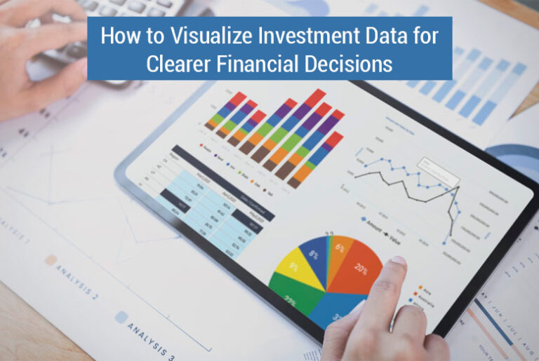
Graphs are excellent for representing trends over time. The most common types of graphs include line graphs, bar graphs, and pie charts.
Line graphs are particularly useful for showing changes in investment value over time. For example, you might track the price of a stock over several months. The line graph can illustrate the rise and fall of that stock’s value, helping you to spot trends.
Bar graphs can help compare different investments side by side. For example, you might want to compare the performance of two mutual funds.
A bar graph allows you to see which fund has performed better at a glance. Pie charts can show how much of your total investment portfolio is represented by each investment, helping you understand your asset allocation.
Tables
While tables might not be as visually engaging, they have their own strengths. Tables can present a large amount of data in a straightforward manner. If you have multiple investments, each with different metrics, a table can help sort through those numbers efficiently.
You might include columns for investment names, current values, growth rates, and dividends. Just remember, while tables are useful, it’s often beneficial to pair them with visual graphs for clearer insights.
Infographics
Infographics combine images and text to explain complex topics clearly and engagingly. They are an excellent way to summarize a lot of information into easy-to-digest formats.
Investors can create infographics showing investment diversification, the importance of long-term investing, or the impact of compounding interest. Many online tools allow you to design your infographics. For example, a simple chart creator can help personalize your infographics with your own data.
Using Software to Visualize Data
Other than charts and tables, various software tools can assist in visualizing investment data. Many platforms offer integrated tools for investors. One such tool is Excel, which allows users to create customized graphs and charts based on their investment data.
More advanced software has features such as predictive analytics and historical data tracking. Programs like Morningstar provide visualizations that can make comparisons among different investments easier. Using software helps not only with presentations but also assists in making informed financial decisions based on data analysis.
Application of Visualization in Real Life
To see how visualizing investment data works, let’s consider an example. Say you invested in three different types of assets: stocks, bonds, and real estate.
Each has unique growth rates and risk factors. By using different visualization methods, you can assess which investment is performing best.
If you create a line graph showing the performance of these assets over several years, trends will emerge. You might notice that stocks perform better during a robust economic period while bonds remain stable during downturns. With this visual data, you can make informed decisions about whether to invest more in stocks or shift funds into bonds during uncertain times.
Steps to Effectively Visualize Investment Data
To effectively visualize investment data, you can follow a structured approach. Here are some simple steps to get started:
Identify Your Data
Firstly, determine what kind of investment data you want to visualize. Are you looking at stock performance, dividends, or perhaps asset allocation? Being clear about the data will help you choose the appropriate visualization method.
Choose the Right Tool
Once you identify your data, select the best tool for visualization. If you’re tracking performance over time, consider a line chart.
For comparisons, bar graphs work well. If you’re summarizing information, infographics may be more suitable.
Create Your Visuals
After choosing the tool, start building your visuals. Input your data accurately to ensure your results reflect reality. Use colors and labeling to make your charts and graphs easy to understand.
Analyze and Interpret
Once your visuals are complete, take a step back and analyze what they say about your investments. Look for trends, patterns, and areas requiring attention. Understanding your visuals is key to making informed financial decisions.
Common Challenges in Data Visualization
While visualizing data can greatly enhance your financial decision-making, it can also present challenges. One common problem is data overload.
With too much information, it becomes difficult to make sense of visuals. To avoid this, focus on relevant data. Prioritize the metrics that matter most for your decisions.
Another challenge is misinterpretation. Viewers may interpret visuals differently than intended. Using clear labels, legends, and notes can help clarify your visuals and lead to more accurate conclusions.
Staying Updated with Investment Data
Investments are dynamic, so it’s crucial to stay updated with current data. Regularly reviewing your investment visuals keeps you informed and responsive to the market’s changes.
Aim for at least monthly reviews of your investment data, adjusting your visualizations as necessary. This practice will empower you to make timely financial decisions, helping you reduce financial stress.
The Path to Informed Financial Decisions
Visualizing investment data is not just a trend-it’s a crucial tool for making informed financial decisions. The tools and methods discussed can transform your understanding of your investments, guiding you toward smarter choices. Start visualizing today, and take control of your financial future!
Need more ideas? Check out our other helpful articles on our website.
Also Read: How Does Pre-Settlement Funding Provide Financial Relief During Litigation?